
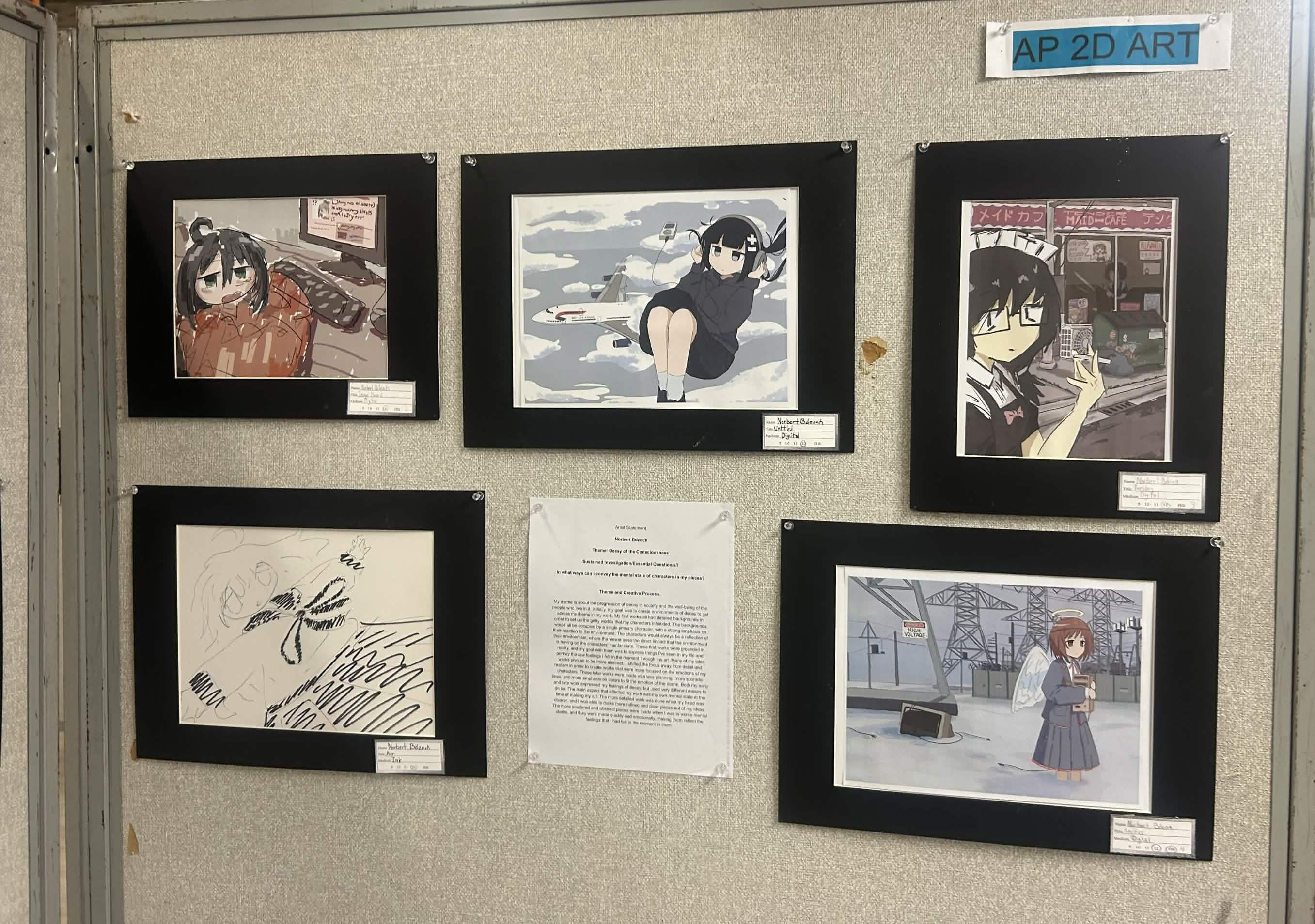
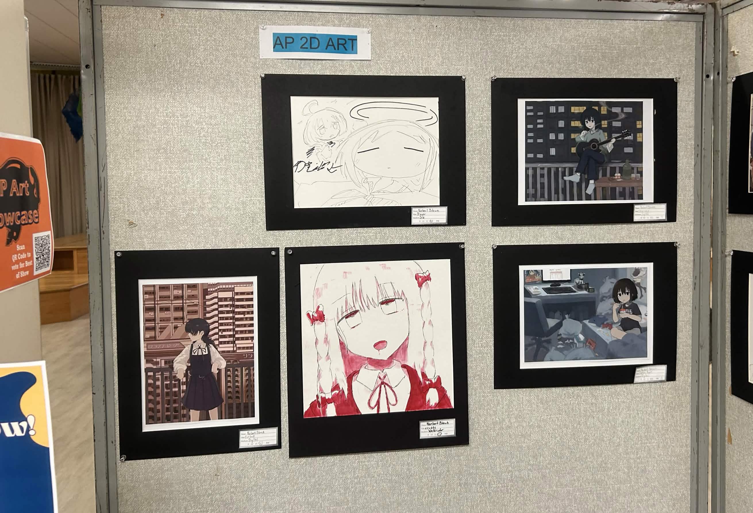
(i am still working on this article)
This project spanned from about September of 2025 to May of 2026.
In my senior year of high school I decided to take my first ever “real” art class. (For those not in the know, AP classes in America are a program that allows high school students to complete college level course work in order to get college credit while still in high school.)
This class was quite a big deal for me as it felt like this was the first step I took toward becoming a “serious” artist. I had began drawing in late 2024 and for a while I was kind of on and off with it. I kinda got started by just doodling anime characters onto all of my classwork while I was bored. During the summer of 2025 was when I really started taking art seriously. I had started my tiktok and instagram pages and I began posting semi regularly to them. As time went on I just kept getting more and more involved with my art and that led me to signing up for AP2D art.
For me signing up for a art class was a pretty big deal as growing up I was always more of a jockish type kid. I had played high level hockey goalie my whole life and I was kind of just expected to hangout with the crowd of people that liked sports and stuff. The older I got, the more I realized that I don’t think I was meant to be that kind of person and I kept experimenting and trying new things.
Anyway, enough about me and lets start talking about the actual art.
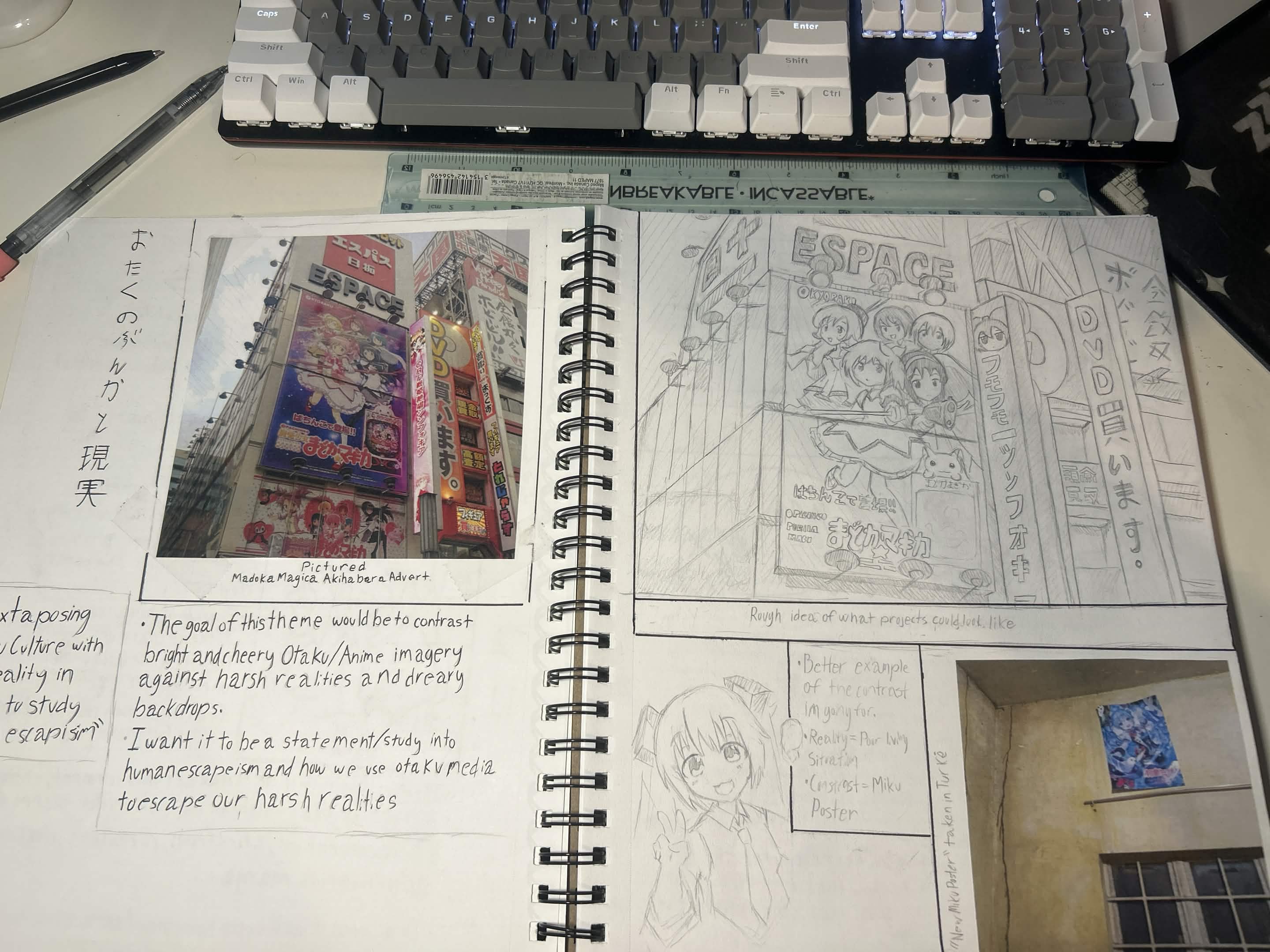
The way that the AP2D art class is structured is incredibly free formed. All of the work that you do in this class is centered around a theme/essential question that you pick at the beginning of the school year. This question is supposed to be some kind of topic or guiding question that you want to explore and develop through your art over the year. It took me a couple weeks to decide on a concrete theme. I knew I wanted to do something anime related but I didn’t really know how to put together a theme.
At the time I was really inspired by like more “degenerate” themes and media. I was really focused on things like 4chan and how for a lot of people, the internet and anime were kind of their life line. Another inspiration for me was the manga I Love Your Cruddy (if you haven’t read it, its kind of a diabolical read). I liked the aesthetic of how messed up the story and concept of it was. It sounds edgy but at the same time I think I was at a low point mentally at the beginning of my senior year.
Eventually I put my thoughts together and created my topic. My topic was emotional decay and my essential question was about different ways that I can portray the mental state of a character.
Something I really wanted to focus on for this project was rendering backgrounds. At the time of the start of the school year, I had only been drawing digitally for like ~2 months, so I really wanted to use school to get better at my digital drawing skills. I had only drawn basic character poses with basic rendering at this point so this was going to be all new to me.
My first project was probably the one that I spent the most time on. At the time I had a very clear idea of some kind of character in a dark room (Again the I Love your Cruddy vibe was coming through here). I was thinking of like something like a character vomiting into a toilet or something with a character involved with some kind of substance abuse. That leads me to a big roadblock I ran into with my project. I landed on drawing a scene of a girl playing guitar and smoking on a balcony. I thought this was a great idea and I was chilling. That was until our teacher required us to send a wip of the project we were working on. When my teacher saw that I was planning to draw a cigarette and a bottle of Jack Daniels, she told me that the school would not allow me to draw things that “go against the school code.” Basically this meant no excessive gore, violence, weapons, or drugs/alcohol.
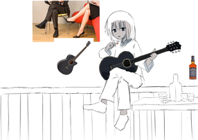
The solution she gave me was to make a lot of the more suggestive things a lot more non-descript. Like the Jack Daniels bottle just became a green bottle with no label on it and there were just blank medicine capsules around it.
The next step of this drawing was to start working on the background. I spent the summer break before that school year in my home of Slovakia and I was really inspired by how bleak the landscapes of apartment buildings are there (known as jinjaki locally). It really brings this kind of insignificance and dread over you and that was exactly what I was going for in the drawing. I wanted to make my character seem really insignificant, where she is a spec living in one of the thousands of other rooms around them.
I started with a rough out line and then used like this water colorish brush on firealpaca to render the rest of the background. I’m not a big fan of this brush and I’m lowk not sure why I was using it but its the brush I went with. I also spent a good amount of time determining the lights of the windows in the background. Originally all of the windows were on and were emitting blue light. After I showed my teacher another wip, she recommended that I should make it so that not all of the windows are on because that is what would be realistic. My cousin also recommended to add the yellow windows and have them be behind the character, giving the scene more of a visual focus on the character. Once the background was rendered I spent some time tweaking some lighting and environment details. The main detail that I added was the smoke drag from the cigarette. This was recommended by my online friend Corno
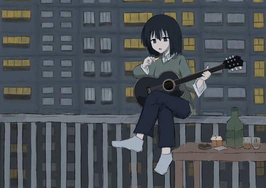
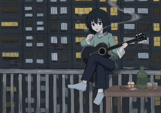
Overall I think this drawing was a good starting point for my project. Do I love it? No. Far from it. I think there is a lot wrong with it and there is a lot I would change but for a first try, it wasn’t the worst.
A theme that is introduced through this project is collaboration. From the beginning of my art journey I have always placed an incredible amount of value in feedback. I always tried to show my work and get feedback from as many people as possible and I told them to not hold back. I didn’t care how harsh a criticism was or what the person was saying, I was ready to listen and fix whatever was wrong. I think this philosophy was a big part in why I was able to see such fast improvement early on. In most of my early works the people most responsible for help and feed back were my online artist friends from the Shimeji Simulation discord (mainly puffle and corno) and my cousin who was attending art school. I think its important to celebrate collaboration in art so if you are an artist reading this I hope you can be inspired to take my advice from this project.
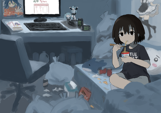
The second project followed the same process as the first one, this time I’d say there was much more planning that went into it. This one drew more inspiration from that 4chan degen idea and I wanted to draw a NEET/Otaku character and how they live.
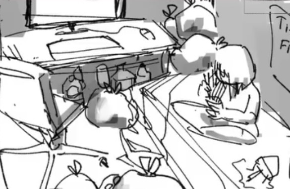
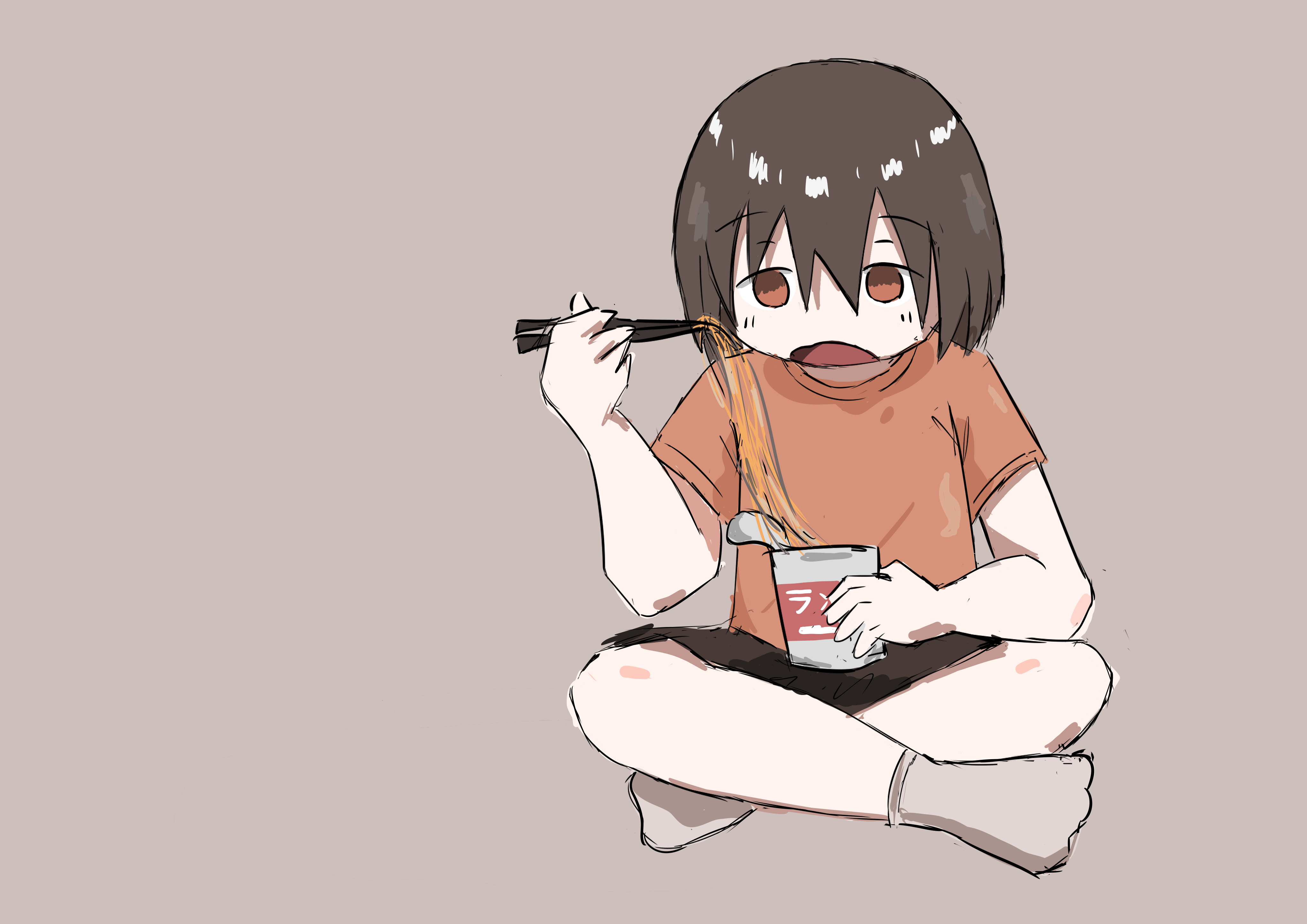
A lot of the concept was thought out with puffle who helped a lot with forming the composition. This ended up with me just deciding to make puffle the actual subject of the piece. We were both in a pretty NEET time of our lives at this point so it was pretty good reflection of how life felt at the time. The actual room is (thankfully) not based on either of our rooms. I ended up just making it a kind of amalgamation of different things I thought should be in an otakus room.
I really like all the details I put in the room and my only regret is the fact that I used that stupid watercolor brush to render the entire background. I think that it would have been much stronger if I used my current method of making backgrounds.
Overall I think I just like this piece because of how much it takes me back to simpler times in my life. I miss being unemployed and online all day.
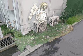
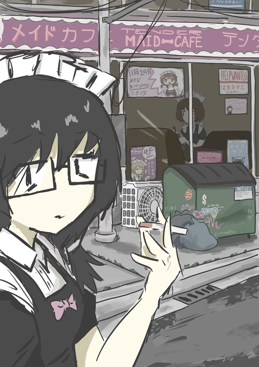
This leads me into my third project, which is one of my personal favorites of this project. The idea for my next project was to scale back and make my scope way more simple. Instead of using the watercolor brush, I sticked to a standard 4 pen brush and used incredibly simple line art. I was mainly inspired by a drawing I found on twitter of an angel on an air conditioning unit. (artist unknown it just kind of lived in my references folder) The concept of less is more was starting to make more sense in terms of the art style, but this did not apply to the amount of detail I put in. I think that this drawing features the most amount small details by far in the portfolio. Some things to look at here are the details of the street signs and the dumpster. The idea here was to take the chaos of a Japanese street and condense it into one scene. To bring it into my theme, I had the idea of drawing a miserable maid cafe worker. I wanted to focus on the contrast between something that should be bright and cheery (a maid cafe on a busy street) and show how miserable it makes the character in reality.
I really adore this work and I think this is when making these bigger scenes on digital really clicked for me. It all just flows and comes together so beautifully, I really should revive this kind of art style and make more scenes that are similar to it.
Now, the fourth and fifth projects (wind and prayer) are my first entries that were made physically. These two drawings hold an incredibly special place in my heart. These were both made in a single day. This day was really strange. I don’t know what was coming over me but it was a kind of sadness/feeling that I still cannot explain. I sat down at the start of my art class, put in headphones, and just started making these drawings with a black ink pen. All of these were done with no outlines and were all made with big confident lines. I think this is biggest “flow state” I’ve ever achieved while making art. On this day I made 4 pieces, two of which I deemed important and good enough to include in my project.
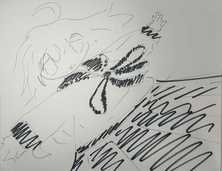
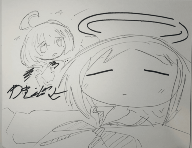
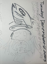
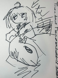
All of these pieces are very inspired by tkimz. Before this I saw a lot of his art where he is focused on these imperfect, but confident lines and strokes. He doesn’t really care about making every line perfect and that was the complete opposite of how I had been drawing for a long time. I was always a perfectionist that would spend hours making sure every line was perfect, but I failed to see how beautiful imperfections in art could be. By being more confident and sparatic I was able to convey my emotions at the time so much clearer and in such a more beautiful way. I really do love this artstyle. If you’d like to see more of this style, visit the art gallery and sort by ink drawings. I made lots of these kinds of drawings in class after how much I enjoyed making these.
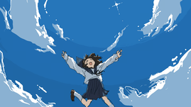
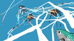
(Some tkimz art I was inspired by)
This next project involved the most planning and thought put into it by a large margin. The main idea I had for this next painting was to draw an energy/power plant near my house that I frequently bike by. If you have gone through my photo gallery you may have seen these beautiful power lines be featured in many of pictures. I found these giant power line structures to be so incredibly serine, I cant describe the feelings of peace and awe that I experience whenever I am near them. Maybe it has something to do with the buzz of static electric they produce, its such a calming sound to me. I felt so moved and attached to this location that I knew I wanted to convey these feelings through an art piece.
The first step I wanted to take was to go on site and take some reference photos for myself. By this point it was now the middle of winter and I had never gone out of my way to go and visit the power lines in the dead of winter. I took my partner, baby ryo, and bocchi fumo and we turned it into a little photoshoot/adventure. This is probably one of my favorite memories of all time. I think everything combined perfectly into one beautiful day and I had a lot of fun throwing a snowball right into the face of my partner (sorry not sorry). All of the photos I got from this day were stunning. Feel free to check them out in the gallery!
With my reference photos acquired I could move onto the actual planning of my project. I had been sketching out a angel like character for sometime now and I had a great idea for what I wanted to draw in this piece. The character I had made was very very heavily inspired by Rakka from Haibane Renmei. I’ve always been struck by the design of her halo holder from the first episode. Its a striking dichotomy to see an angel, a being of perfect purity, have to use a clumsily made holder in order to maintain her divine appearance. Something about a character that’s supposed to be perfect but is very much imperfect speaks to me a lot.
With all this said though, I was looking to go in a slightly different angle in this piece. I wanted to kind of cover human instrumentality and the idea of humans merging with technology for a “better” future. I wanted my character to try to merge and become one with technology to escape whatever hopeless situation they were coming from. Here my character is a human who is pretending to be a kind of digital angel seeking some kind of salvation. I chose to draw the background as being more and more cluttered as you go from left to right to show that she is moving away from her old reality and toward the salvation of the energy grid.
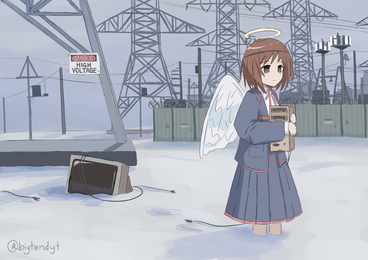
Overall I quite like this piece. I spent a long time making it and all of the planning and thought that went into it makes me more attached to it. I’m not sure if my messaging that I described comes through in it but I think it is still a pretty striking and aesthetic piece and that’s almost always my goal when making art.
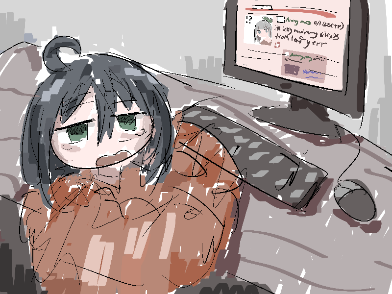
The next piece I made was another kind of spur of the moment piece that I made. I remember down to draw one night and my head hurt so much that I couldn’t focus on making any clean art so I kind of just said fuck it. I just opened a low res firealpaca file and started drawing how my head felt. I ended up drawing something kind of similar to the ramen piece and drew a character browsing 4chan. Specifically I drew the /s4s/ board showing the actual pinned post from New Years 2026. Anyways I like the flow and energy of this one a lot. Also I had recently discovered the power of the square brush and you can see that in this work.
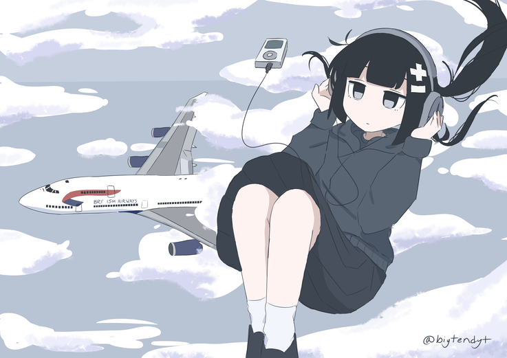
The next piece is another personal favorite of mine that has a moderate amount of backstory behind it. The idea for this piece came from my daily walk to school at the time. I lived very close to O’Hare Airport (one of the busiest airports in America) and my town is very much known for having planes constantly taking off and landing incredibly close overhead. Every morning as I was getting close to the clearing of where my school was, I got clear views of planes coming down for a landing.
My initial plan was to draw a character experiencing exactly what I was doing and was going to be a bottom up perspective of someone walking as the plane descends on them. This idea though eventually morphed into the final idea of a character falling out of the sky with a plane by them. I don’t know what lead to that idea but I really liked it. I wanted the character to be completely unbothered as they were listening to music. I guess this one can be interpreted as how it feels to listen to a song or the fact that the music is so good the character doesn’t care, I didn’t really think that much into the message of this one. I also chose inabakumori as the character mainly just off of vibes. This entire piece was basically made off of vibes.
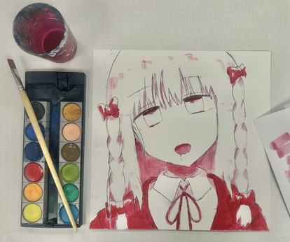
This next piece involved probably the most work put into it by far as this was one of my first watercolor/acrylic paintings. Prior to taking AP2D art I had literally never touched anything paint related in my life. I have strictly been drawing with standard pen and pencil but I had decided that I wanted to expand my horizons(especially because all of the supplies were provided to me for free from the class)
I started by being really inspired by this series of art pieces drawn by someone on twitter where they drew characters with these sporadic outlines and only used shades of red for all the shading. They were using acrylic and watercolors for all the shading, making it look like the character was covered in blood and I loved this look so much. So much so that I tried to copy it myself. I started by painting on these little mini squares of paper and I thought that it would be easy enough to learn as I was only using one color to paint. Here are some of those attempts:
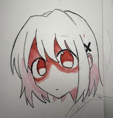
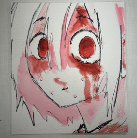
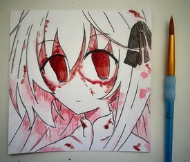
I had a marginal improvement in each one before I felt confident enough that I could transfer that skills to an actual larger painting. In the end I think It came out really great.
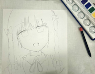
This last piece was probably most most simple in concept and idea. This one is basically surrounded by the fact that I had finished Chainsawman part 2 after finishing part one a whole 2 years before this. I loved Chainsawman part one and after finishing its manga I was so content with it that I just saw no reason to keep reading it. Part one is genuinely up there as some of my favorite manga reading moments but I have this thing with anime and manga where I tend to never go past a certain amount of seasons/part. If a season or manga reaches a part where the story has reached a satisfying conclusion, and there are still more seasons after it, I tend to just leave it right there. I’m not sure why I do this, maybe its just to avoid potentially ruining my positive impression of that media with a stinker of a season. I think another good example of this for me is with Initial D where I just watched the first season, loved it, and never felt any urge to go and keep watching it. Anyway, under the pressure of my partner and the big conclusion of Chainsawman’s manga releasing, I decided to pick up part two.
I really loved vol 12 and 13 mainly because of how amazingly Asa is set up as a character. The problem is the fact that Fujimoto goes nowhere with this and destroys her character and most of the story from this point forward. I think part two was very okay and wasn’t anything hear what the first part had accomplished.
Anyway, I still loved Asa as a character and I wanted to give her justice by making her the subject of my last piece in the project. I loved all of the scenes in vol 12 on balconies that show how miserable the surrounding world of Chainsawman is. I wanted to draw my own take of it.
With that last piece wrapped up I had now reached the end of my portfolio project! This project has ended up as one of the coolest, most interesting, and most memorable things that I have ever done. To be able to see almost a full years of growth laid out across one project is really cool. This was also made during a time where I think I was seeing the most amount of improvement ever in my artistic ability and shows just how important of a time this was for me. I cam into this project as essentially a beginner artist that had no real world connections or experience with my art and came out as a much better artist with a whole community of friends and supporters that helped me along the way.
To celebrate the ending of our class portfolio, every year our school holds an art show in our school library where each student that has a portfolio is able to put all of their on display. This show included almost all of the AP art subjects which meant that not only were our paintings and drawings on display, but there were also sculptures and photograph portfolios on display from their respective classes. The whole show was really beautiful and I it was a very nice moment to be able to look at the whole years worth of hard work that every student had brought to the show. Many students were in multiple art classes so they were able to display both their AP2D art portfolios as well as their sculptures and so on, so their displays were able to be really tricked out. Being honest my display was being pretty heavily mogged mainly because of the fact that my digital art was a lot less eye catching when compared to the many giant paintings and sculptures (it also didn’t help that I didn’t have access to any good printers so all my digital work was printed on normal paper).